Graffiti Styles
Graffiti Styles
Tags: are pseudonym signatures and are the simplest form of graffiti. They consist of a unique blend of various elements and one-color signatures that represent the artist’s assumed identity.
A Throw-Up is an evolved tag that is often sprayed quickly. The writer incorporates bubble letters to “throw up” or create a two-to three-letter name. A throw-up usually consists of two colors, one for the outline and the other as a rough fill-in. This approach is the quickest way to create a large work.
Pieces are considered to be masterpieces. They are more elaborate than tags or throw-ups and usually incorporate more letters than throw-ups. At a minimum, a piece contains an outline color, a fill color, a background color, and a highlight color. The main visual difference between a throw-up and a piece is that a piece is filled completely and the letters are more clearly defined.
Wildstyle: refers to unreadable interlocking letters that signify direction and a flow of movement. A wildstyle piece generally uses arrows and arrowheads to create an indication of letter flow. Exaggeration and interconnecting letter play are the keys to a good wildstyle piece.
A 3-D is a style of letters that gives the illusion of three-dimensions and is used for added effect on basic letters. This approach is sometimes applied to a wildstyle for an extra level of complexity.
Fading means to blend colors.
Computer style is a certain form of wildstyle that appears to be digital or bitmapped, as if created from a computer.
Good Graffiti is based on
1. Control of graffiti artists’ hand in drawing and painting
2. Use of color
3. Stylistic innovation (letter design)
4. Flow (does the piece show movement)
(terms based on article "Graffiti: The Use of the Familiar" by J. Whitehead)
To Do:
Working in groups, print out an example of each style & label accordingly. (why? b/c I want to make sure you guys know whats what.)
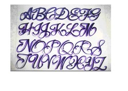
Lettering Project
1. go to: www.dafont.com
2. Print out up to 3 different handwriting
or calligraphy lettering alphabets.
3. Select your favorite and begin practicing over & over again. why? b/c you won't get better at lettering unless you practice! this will also help your airbrushing techniques.
Final project: Your name in the lettering you studied on drawing paper using ink.
We will be airbrushing next...
Let's break it down. Start with simple lettering & layouts. The fancy stuff comes later.
Airbrush Backgrounds
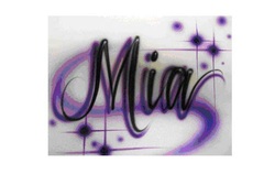
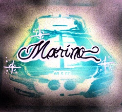
Level 1: Drop Shadow
1. Drawpaint name in black.
2. Drop shadow with 2nd color
3. Try a simple white highlight
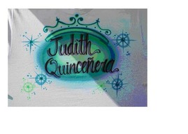
Level 2: Adding Stars, dots & color background
1. Make a circular outline
2. Fill in lightly with 1 or 2 colors
3. write name; add drop shadow
4. add design elements (stars, dots etc)
1. Make a circular outline
2. Fill in lightly with 1 or 2 colors
3. write name; add drop shadow
4. add design elements (stars, dots etc)
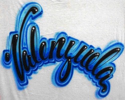
Level 3: Outlining name
1. Draw/paint name
2. Outline name with 1 color
3. Fill with 2nd color
4. Add drop shadow
5. Highlight with small white dots or lines
1. Draw/paint name
2. Outline name with 1 color
3. Fill with 2nd color
4. Add drop shadow
5. Highlight with small white dots or lines
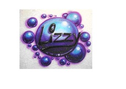
Level 4: 3-D Background
1. Draw/paint background (heart or bubble)
2. Fill in with 2nd & 3rd color making sure to blend along edges. Follow contour of shape
3. Draw/paint in name
4. Add drop shadows
5. Add white highlights for 3-D effect
1. Draw/paint background (heart or bubble)
2. Fill in with 2nd & 3rd color making sure to blend along edges. Follow contour of shape
3. Draw/paint in name
4. Add drop shadows
5. Add white highlights for 3-D effect